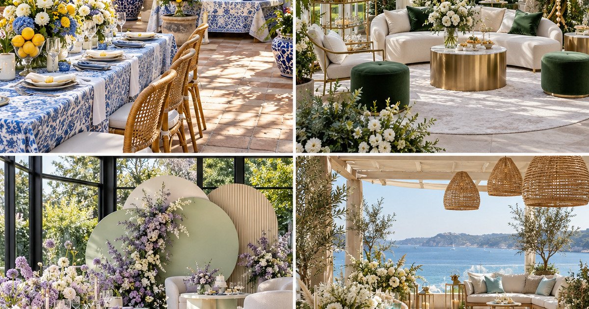
A sophisticated baby shower does not need to default to pale pink or baby blue. A more memorable palette often begins with the venue, the season, and the guest experience—then uses two or three intentional colors across linens, flowers, paper, tabletop, dessert, and lighting. These ten baby-shower color palettes offer distinct moods without relying on predictable themes.
Best for: showers of approximately 20–60 guests
Planning time: 2–4 hours after the venue is selected
Styling time: commonly 3–6 hours, depending on rentals and florals
Skill level: beginner to intermediate
Palette rule: one anchor color, one supporting color, one neutral, and one metallic or natural texture
How to turn a palette into a complete room
Use the anchor color on no more than two large surfaces—such as linens and a backdrop. Repeat the supporting color in smaller moments: napkins, menus, glassware, ribbon, or flowers. Let the neutral cover the largest visual area so the room can breathe. Metallic accents should appear consistently in frames, candleholders, flatware, or vessels rather than as unrelated pieces.
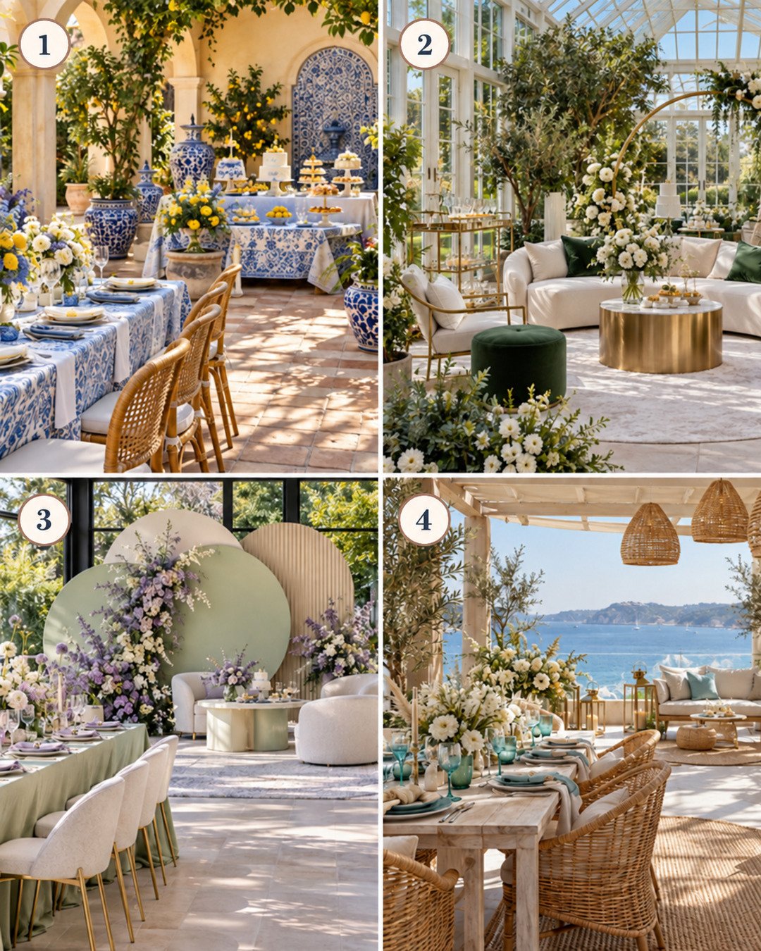
1. Mediterranean cobalt, lemon, and ivory
Mood: joyful, sunlit, and collected. Use cobalt on patterned linens or vessels, lemon yellow in flowers and fruit, and ivory for draping, plates, and candles. Woven chairs and natural stone keep it warm.
Best venue: courtyard, terrace, or bright dining room. Suggested footprint: about 18 × 24 feet for 30 seated guests. Avoid: adding another strong primary color; let citrus and foliage supply the accent.
2. Emerald, pearl, and champagne
Mood: polished garden glamour. Emerald velvet or napkins anchor the room, pearl details soften it, and champagne metal adds quiet shine. White flowers and deep greenery make the palette feel luxurious without becoming dark.
Best venue: conservatory or ballroom with daylight. Upgrade: pearl-edged place cards or a mother-of-pearl cake detail.
3. Lavender, pistachio, and cream
Mood: modern botanical softness. Keep lavender dusty rather than neon; pair it with muted pistachio linens and rounded cream furniture. Use lilac, delphinium, white stock, and airy greenery.
Best venue: modern garden room. Surface protection: place waterproof liners beneath potted plants and floral containers.
4. Coastal aqua, sand, and brass
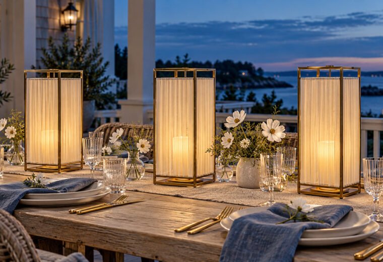
Mood: relaxed waterfront elegance. Aqua glassware and napkins provide color, sandy linen and woven fibers ground the space, and brass lanterns or flatware add polish.
Best venue: covered patio or waterfront terrace. Outdoor note: secure paper, menus, textiles, and lightweight décor against wind.
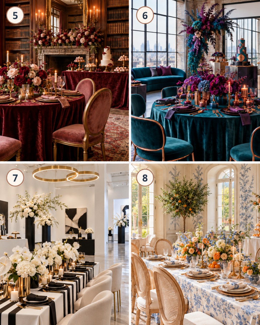
5. Oxblood, dusty rose, and antique brass
Mood: romantic old-world dinner party. Use oxblood on velvet linen or ribbon, dusty rose in seating and flowers, and antique brass for candleholders and frames. Cream plates and glassware prevent heaviness.
Best venue: library, historic home, or private dining room. Lighting: use venue-approved flameless candles if open flame is restricted.
6. Peacock teal, amethyst, and copper
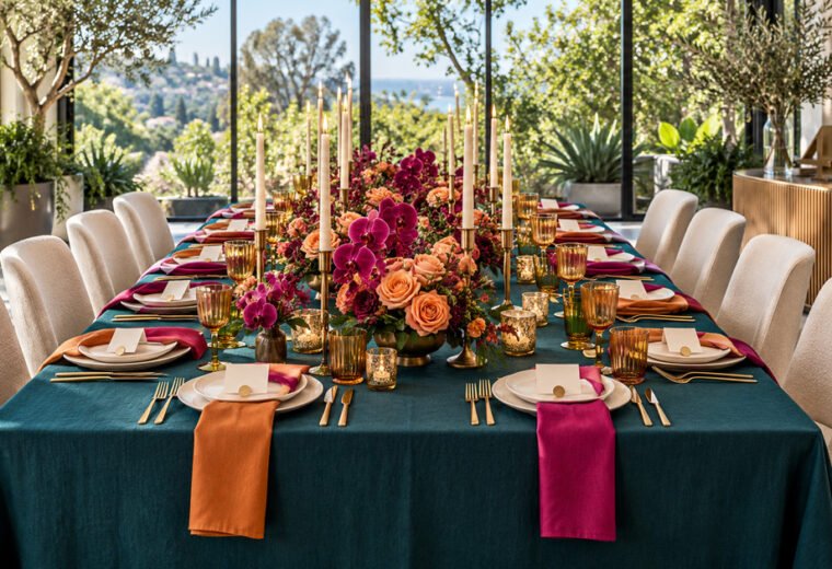
Mood: artistic jewel-tone celebration. Teal is the large surface, amethyst appears in flowers and stationery, and copper warms the combination. Keep ceilings and walls visually simple.
Best venue: contemporary loft. Budget strategy: rent one dramatic teal linen style and repeat it; use colored napkins rather than replacing every rental.
7. Black, ivory, and champagne
Mood: fashion-forward and graphic. Black napkins, cake details, or stripes create structure; ivory flowers and furniture soften it; champagne lighting prevents the room from feeling stark.
Best venue: gallery or white loft. Balance: keep black below roughly one-third of the visible room unless the venue is extremely bright.
8. Apricot, cornflower blue, and cream
Mood: cheerful European garden. Apricot flowers and fruit warm the table, cornflower blue appears in patterned linens or glassware, and cream keeps the design refined.
Best venue: sunlit dining room. Optional upgrade: hand-painted menu cards that repeat the blue floral pattern.
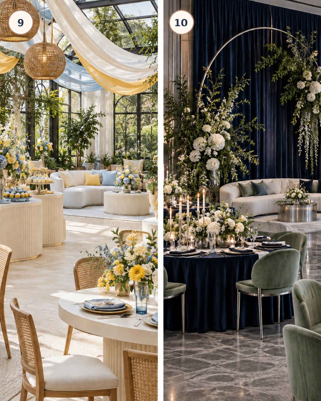
9. Saffron, powder blue, and warm white
Mood: bright, optimistic, and airy. Saffron flowers and draping provide warmth, powder blue cools the room, and warm white furniture makes the palette feel spacious.
Best venue: botanical atrium or spring garden room. Layout: round or curved tables echo the soft, buoyant palette.
10. Deep navy, celadon, and brushed silver
Mood: contemporary evening elegance. Navy draping and linens create depth, celadon chairs and foliage introduce life, and brushed silver vessels reflect light without the warmth of gold.
Best venue: modern ballroom. Lighting: aim soft light at flowers and tables so navy reads as blue rather than black.
Palette planning worksheet
- Photograph the empty venue in daylight and event lighting.
- Choose one anchor color that works with the walls, floor, and fixed furniture.
- Add one supporting color and one light neutral.
- Select only one metallic or dominant natural texture.
- Assign each color to linens, tabletop, florals, dessert, signs, and seating before shopping.
- Build one sample place setting and photograph it under venue lighting.
- Remove any accent that appears only once; repeat it intentionally or leave it out.
Safety and venue protection
- Protect tables, stone, wood, and rugs from floral water, wax, dyes, and metal.
- Use nonslip pads beneath rugs and floor décor.
- Keep exits, service doors, extinguishers, and accessible routes clear.
- Weight freestanding backdrops according to their structure and venue rules.
- Secure outdoor linens and paper without creating trip hazards.
- Confirm flame, ceiling, wall-fastener, and electrical restrictions in writing.
Troubleshooting
The colors look childish: mute one color, add a sophisticated neutral, and reduce literal baby-theme props.
The room feels too dark: move the deepest color to napkins or draping accents and expand the neutral surfaces.
The palette looks disconnected: repeat every accent at least three times across different zones.
Rental colors do not match: compare physical swatches under venue lighting and choose intentional tonal variation instead of chasing an impossible exact match.
The budget is spreading too thin: concentrate color on the guest tables and one focal area; keep the rest neutral.
Frequently asked questions
Can I use more than four colors?
Yes, but treat extra shades as variations within the palette rather than equal competitors. One anchor, one support, one neutral, and one finish keep planning manageable.
Should the invitation match exactly?
It should signal the mood and core colors, but it does not need to reproduce every linen or flower shade.
How can I make a palette gender-neutral?
Build around the venue, season, materials, art, travel, or botanical inspiration rather than coding the design around a gendered color.
Final styling checklist
- Venue colors photographed and considered
- Anchor, supporting, neutral, and finish selected
- Physical swatches reviewed in event lighting
- One full place setting tested
- Palette repeated across at least three décor zones
- Backdrop and large linens do not compete
- Floral mechanics and surface protection planned
- Outdoor weights and weather backup confirmed
- Required exits and routes remain clear
- One focal moment prioritized for photographs
Show your palette to creators who understand the details
Join the Elegant Creators Community to exchange ideas, get creative feedback, and connect with decorators and DIY creators.
Join the conversation
What do you think?
Share your thoughts, questions or experience with this design. We would love to hear from you.